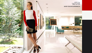
With all the retailing stuff that I get, whether via email or catalogs, it's not unusual for me to sometimes like the setting better than whatever the model is wearing. Sometimes I like the furniture, other times it might be the whole room arrangement. Maybe this is because I'm an architect and design buff, but I suspect that's a stupid assumption. I'm sure many people can appreciate the decor without having gone through the torture of art/architecture/design school. I hear life is peachy for you first years in the JD program ;)
Regardless of your college studies, I'm sure we can agree that the backdrop matters as much as the pantsuit, stilettos or to-the-floor sequin dress on display. Anthropologie seems to favor that disheveled European hamlet world, while Macy's prefers sleek office buildings. J. Crew was on a kick awhile back with the California mid-century mod home, which I've since seen popping up in other places. They also did an issue set in a large train station, and it made me want those pencil skirts and cardigans *that much more.* Thanks to carefully filtered light and color choices, the scene sets the mood of the clothes, and I want to step into that space and have a look around.
Or, sometimes I just want to steal a chair. Pass on the pleather-ish yellow pants, though.
The above ad, sent out by retailer Singer 22, is showing off an outfit that reminds me of Ronald McDonald (and now makes me shudder at the thought of the recent re-launch of the McRib...). However, I enjoy the hazy lighting and definitely like this chair/couch thing.
Shopbop is showing off a cute little number on the gal, but I'd much rather buy that big, comfy couch. In yellow.
Here's another photo from Shopbop. Yes, it's nice that the clean, sleek lines of the color-blocked outfit harken back to the mid-century mod look of the room. Someone tell her she's off the clock and can go right home. I want to move in and throw a dinner party in there. Now.
And here's an image from the aforementioned J. Crew catalog issue:
This is the Kaufmann House, for you design enthusiasts, designed by architect Richard Neutra. Again, I want to kick out the models (I might swipe her dress, though) and move in. And, of course, throw a dinner party. Or maybe a pool party, as there's a pool lurking in the dark to the left of the house.
I found the photo attached to an interesting blurb in Metropolis magazine's online archives; the writer talks about architecture "selling out" to, uh, sell products to the masses (it also drops the whole "cool music getting commercialized" conversation on the plate). If you're so inclined, give it a read, and I'll follow up next time with some thoughts on the topic.
Images:
#1 - Singer 22
#2 & #3 - Shopbop
#4 - Metropolis Magazine online


No comments:
Post a Comment